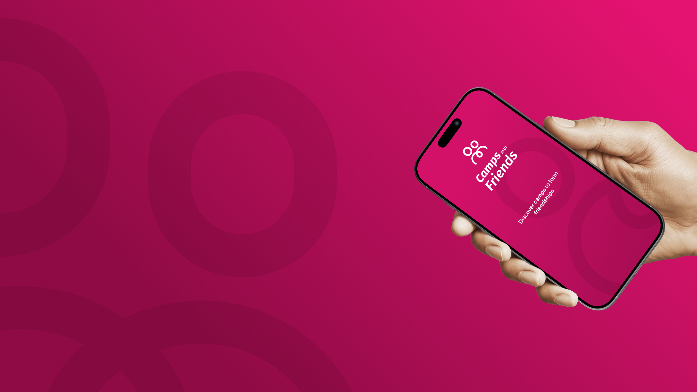
The Product —
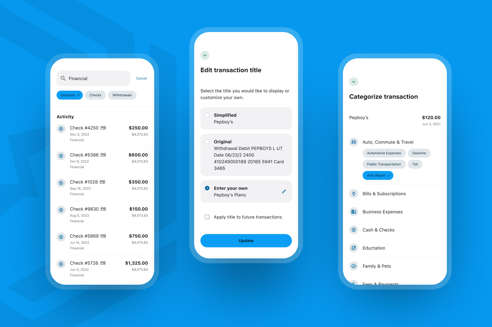
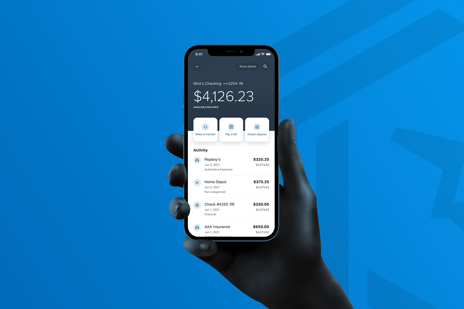
The Accounts page holds a very important role because it’s the landing page that every user sees upon opening the app, and it’s the first page they interact with. Our priority was to design it in the most efficient way for users to see their accounts at a glance and provide ways for users to access all of the other banking features, simultaneously. For instance, the user can view their account, available and current balances, while also drilling down to view their transaction history. The accounts landing page is perceived as the nucleus of the Alkami banking system, the center, and the most important part. So, it was time to give it some enhancements.

The Challenge —
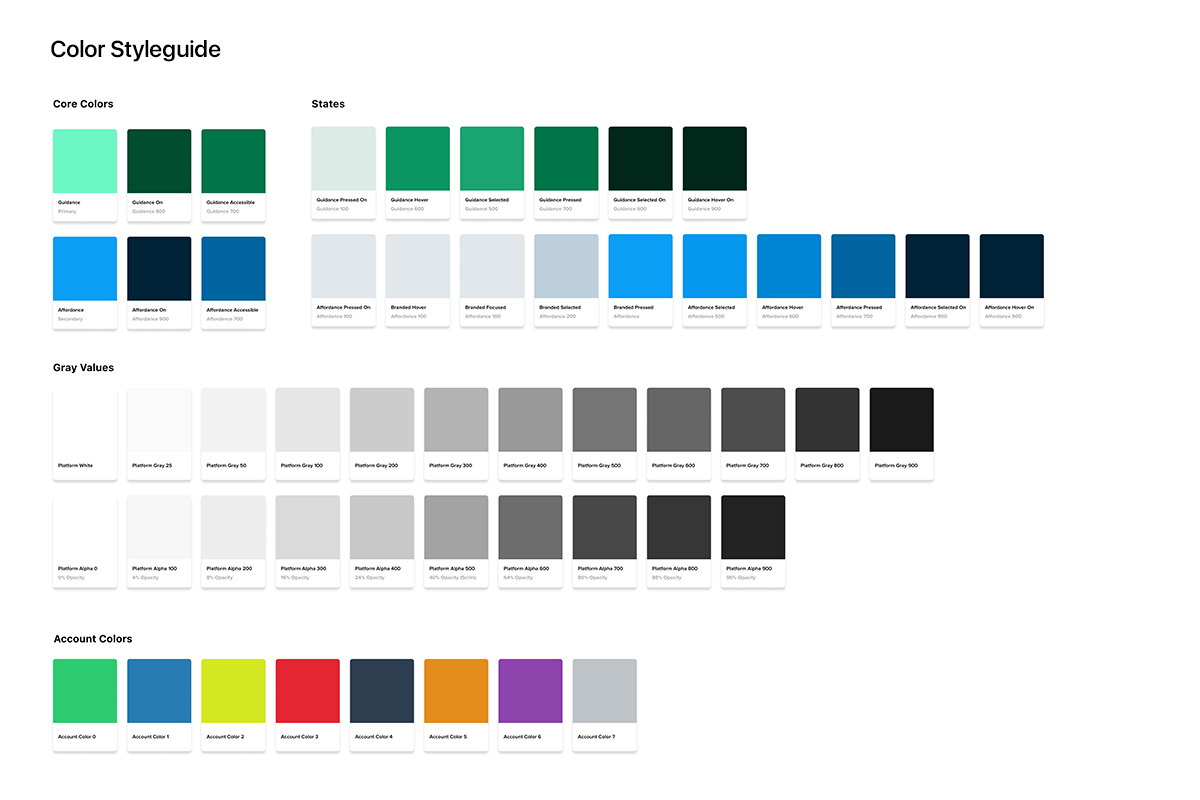
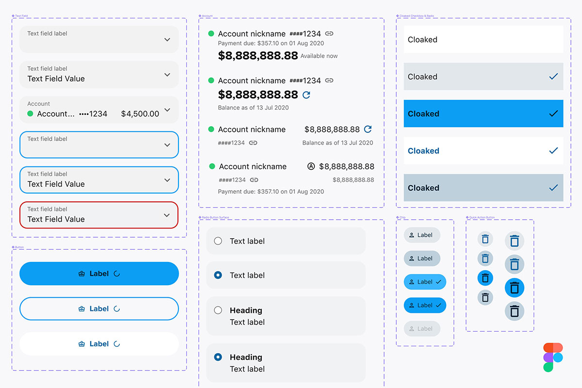
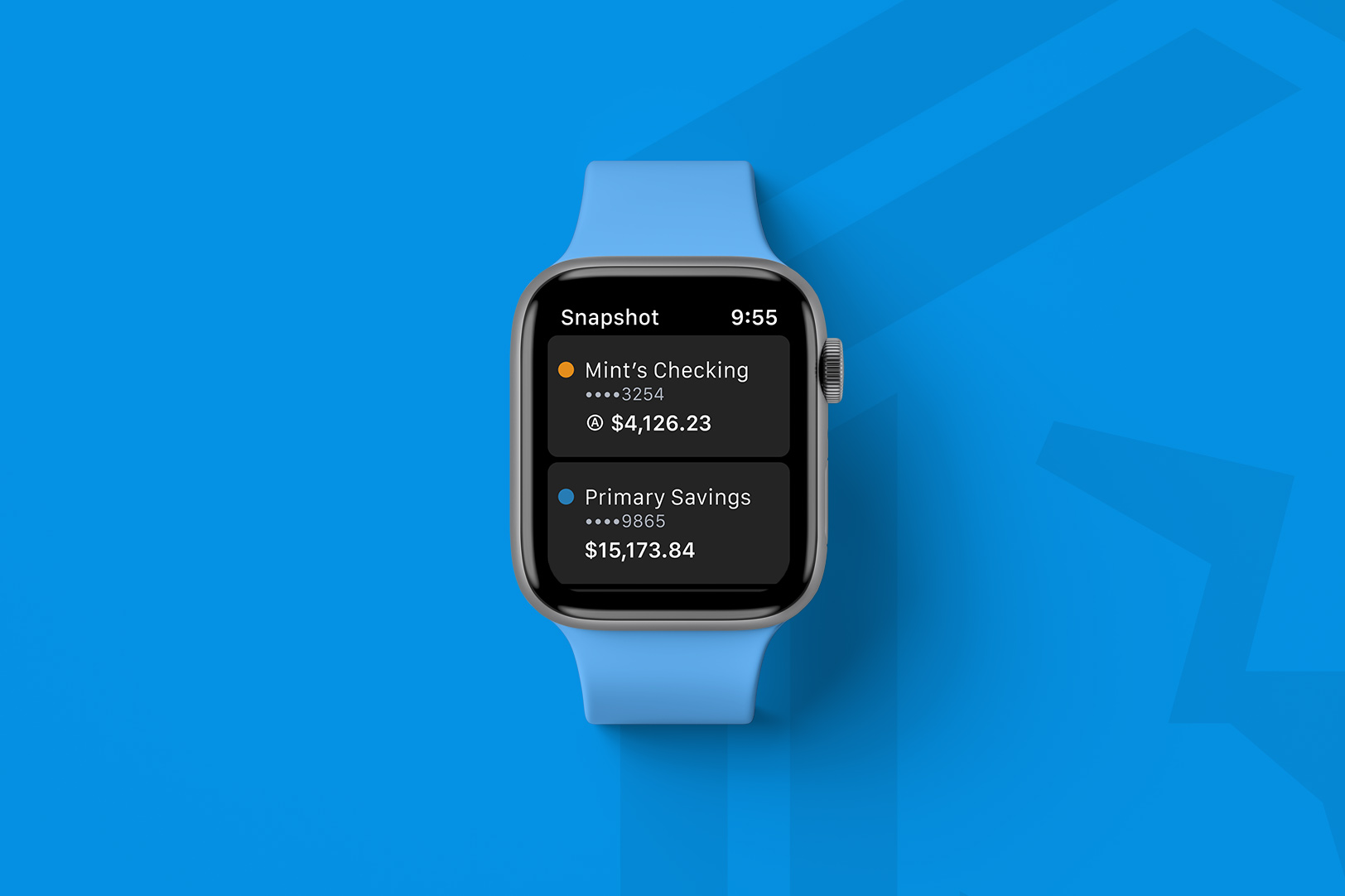
With our new design system in place and ready for prime time, it is time to move our Accounts experience into the new era. Previously, we had a Snapshot at launch to give our users a glance at their balance for select accounts. Today’s new biometric technology has given us an opportunity to merge Snapshot and Accounts into one product that works seamlessly within the app. Since our engineering team would be the first development team to use our new Flutter-ready components of the design system, it required working closely with our front-end engineering team to ensure that the dev team clearly understood the components’ interactions and report any bugs that might arise. The design of a mobile-first product that could extend to desktops in order to allow development teams to use a single code base for both platforms was a big key to our design approach.
Discovery & Ideation —
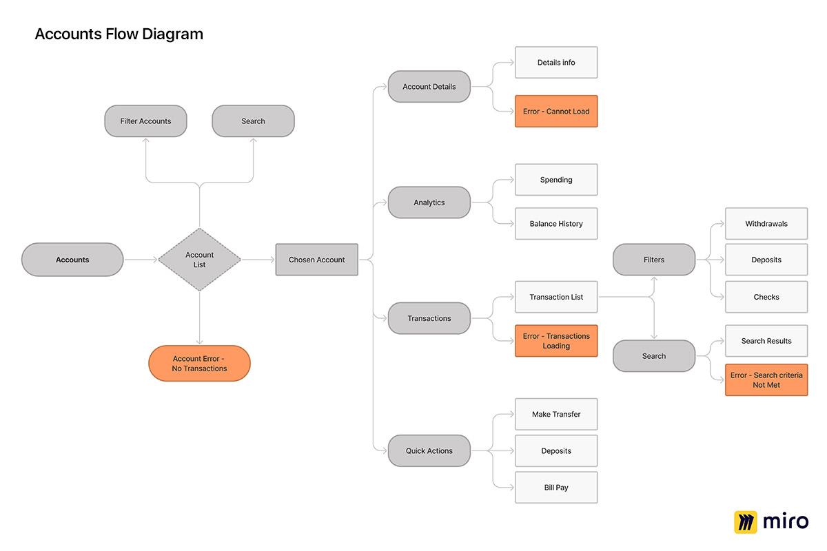
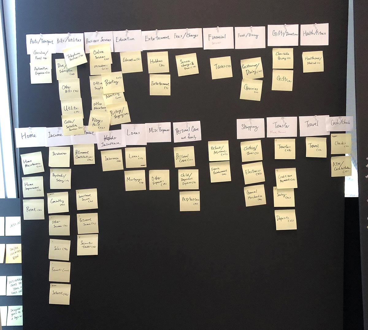
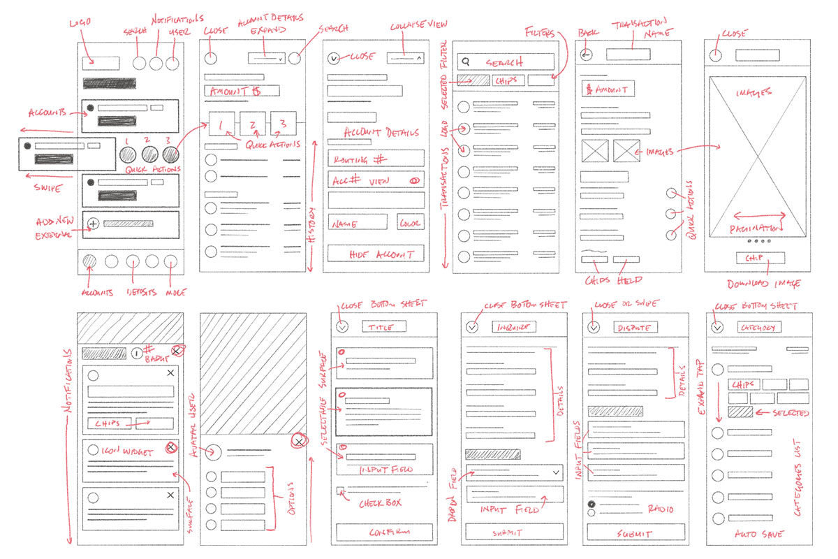
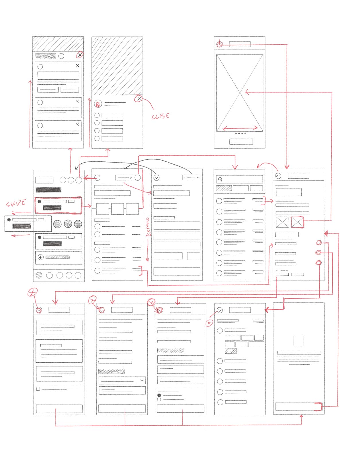
The goal was to make the experience very simple and super easy to use. I started by mapping user journeys based on the primary tasks and drawing sketches/wireframes to get a feel for the user’s experience, a user’s interactions, and navigation patterns that could be used. I created an accounts flow diagram so our team could visually see what items were going to be needed and taken into consideration during our lo-fi wireframes. As a team, we also conducted a sticky note chart of all the possible categories that a user can use so we can then implement it into our design. Another designer and I collaborated in creating a lo-fi design to conduct a usability test to measure how well users can successfully perform the tasks and help us identify any usability issues. After many sketches and rounds of iterations, we gathered feedback from our design team, product owner, and the tech lead. All the collaboration and feedback helped shape the final direction of the hi-fi designs.
Solution —
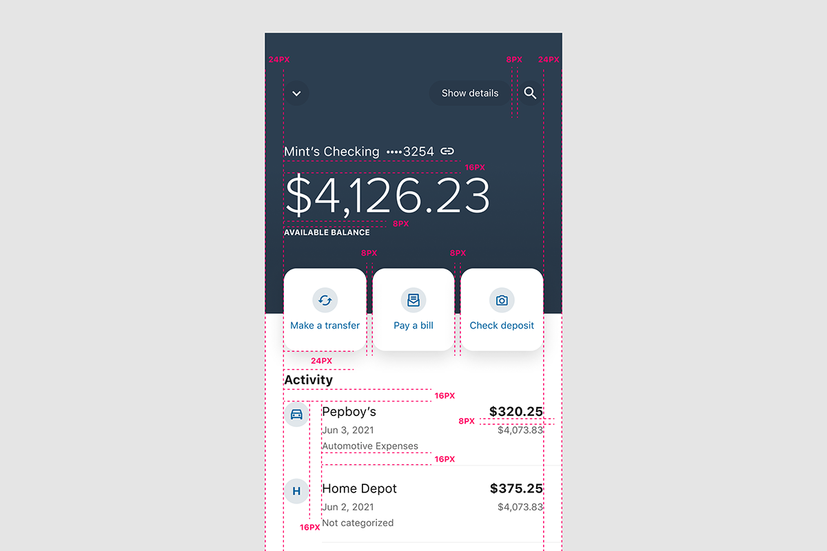
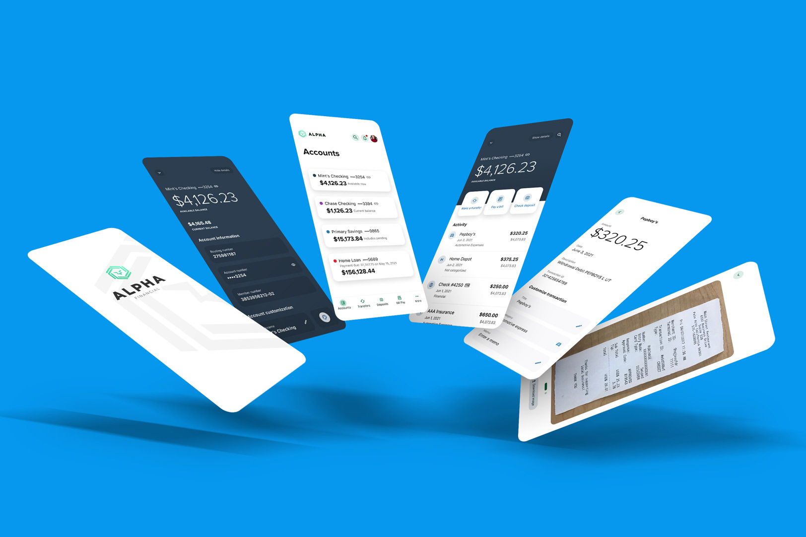
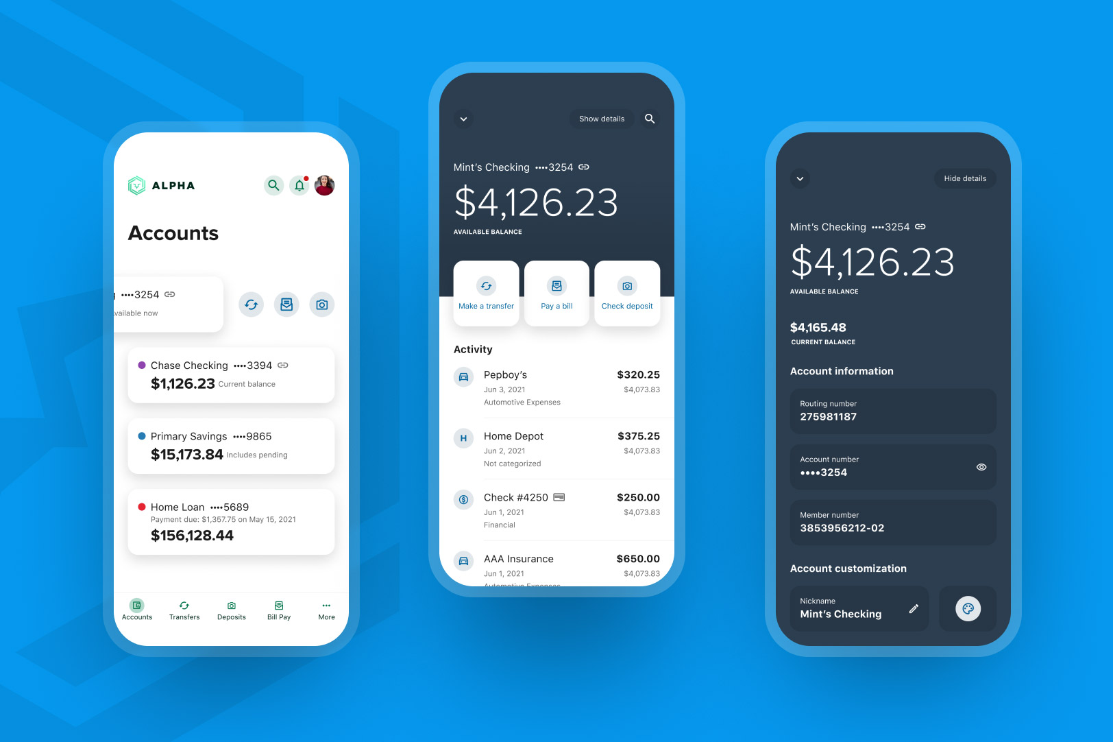
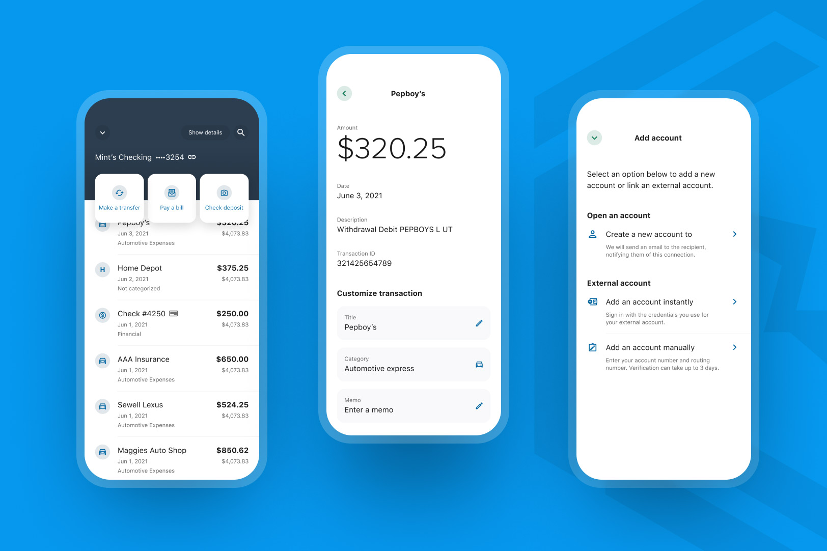
The final result is a mobile design solution for Accounts reflecting Alkami’s design system, components, and philosophies so that it has a consistent look and feel that brings an intuitive user experience and delightful design to the Android and iOS applications. This is a significant improvement over the native Legacy Accounts experience we have previously used before. We have had very positive responses from all our product owners and across the organization in this new design direction.

Touchpoints