

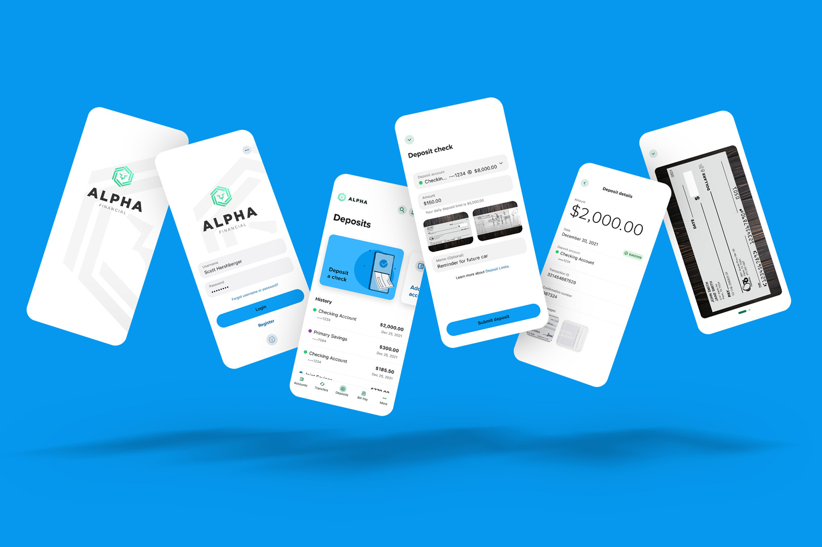
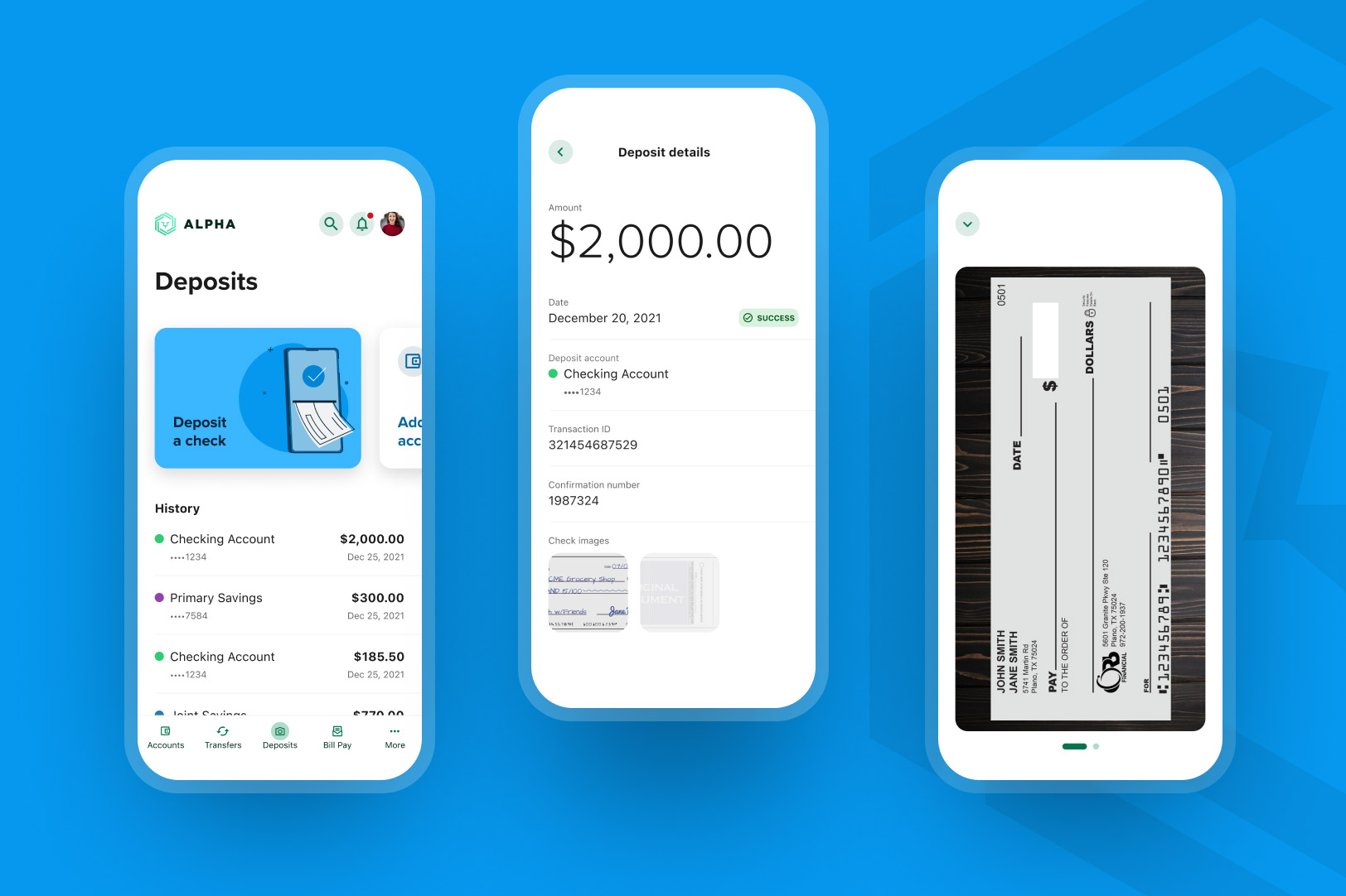
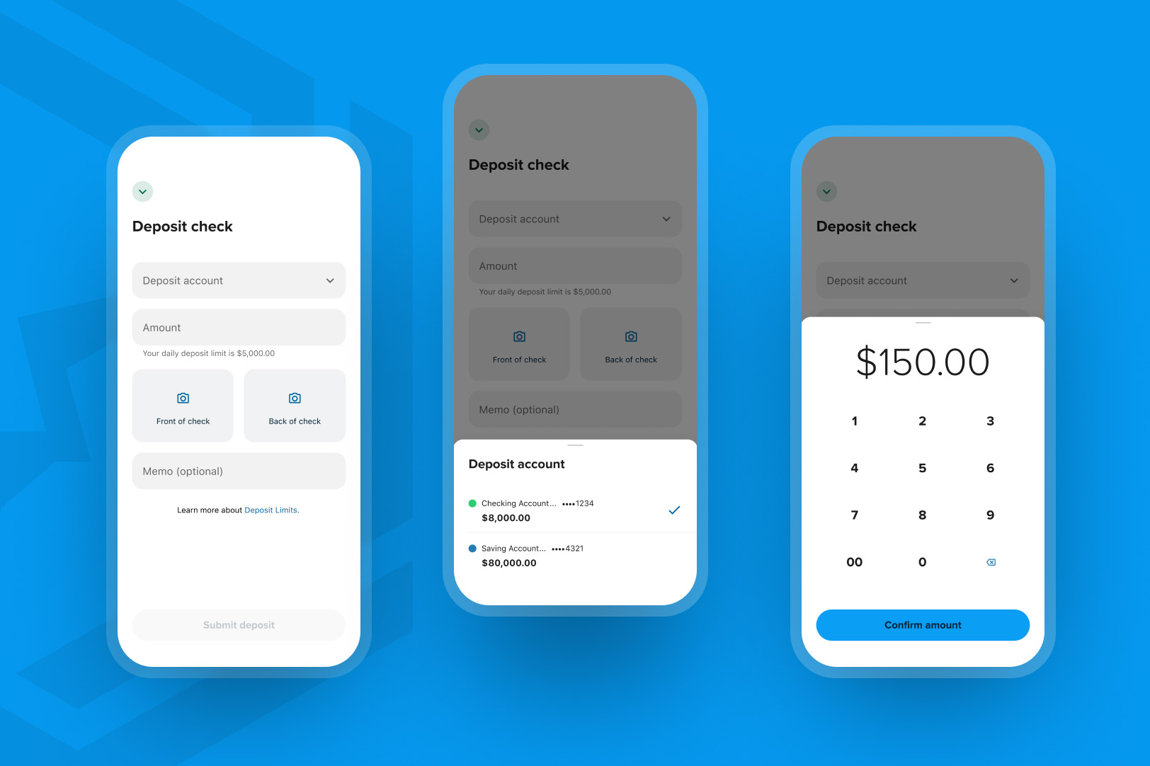
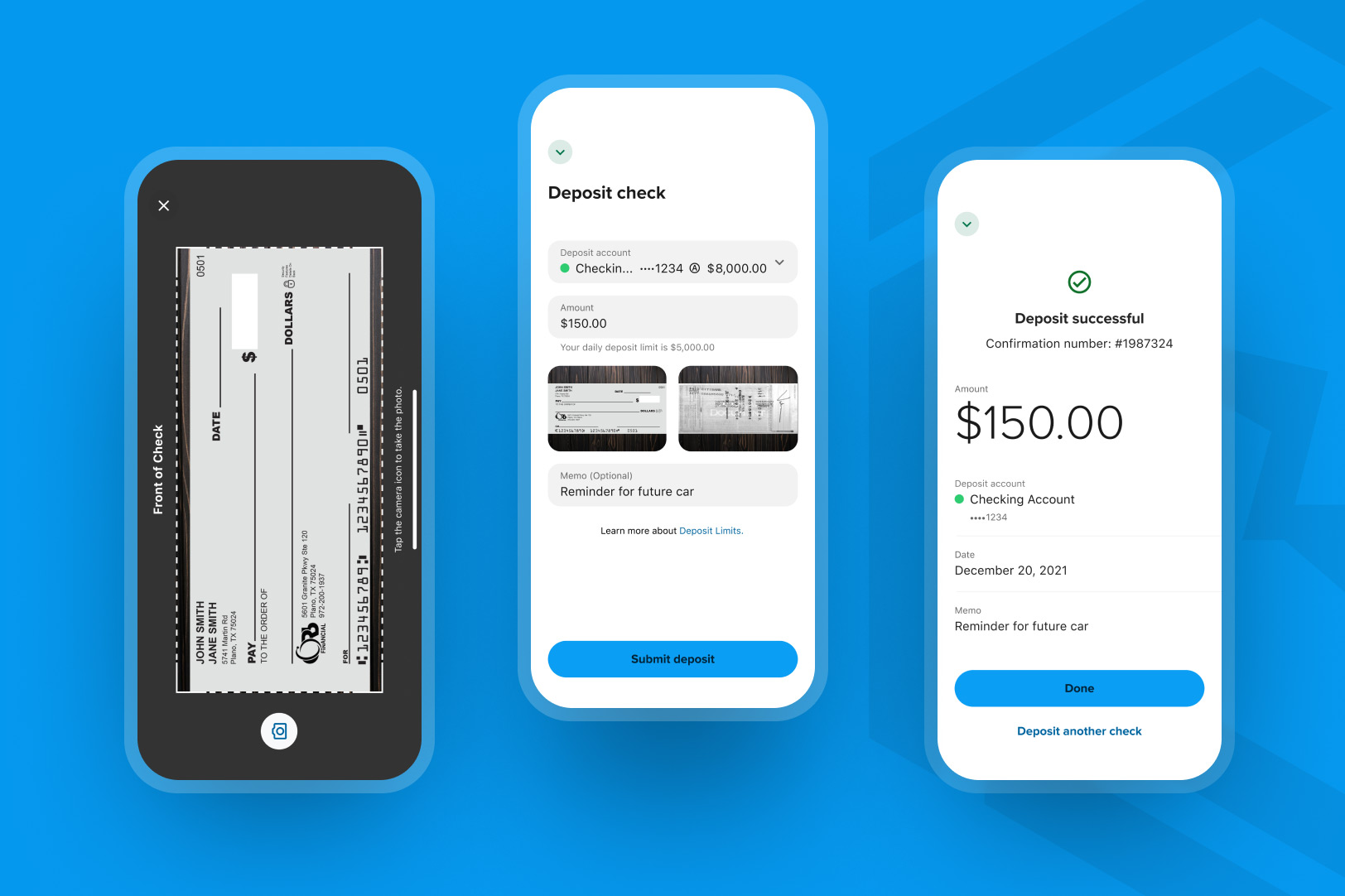
The Product —
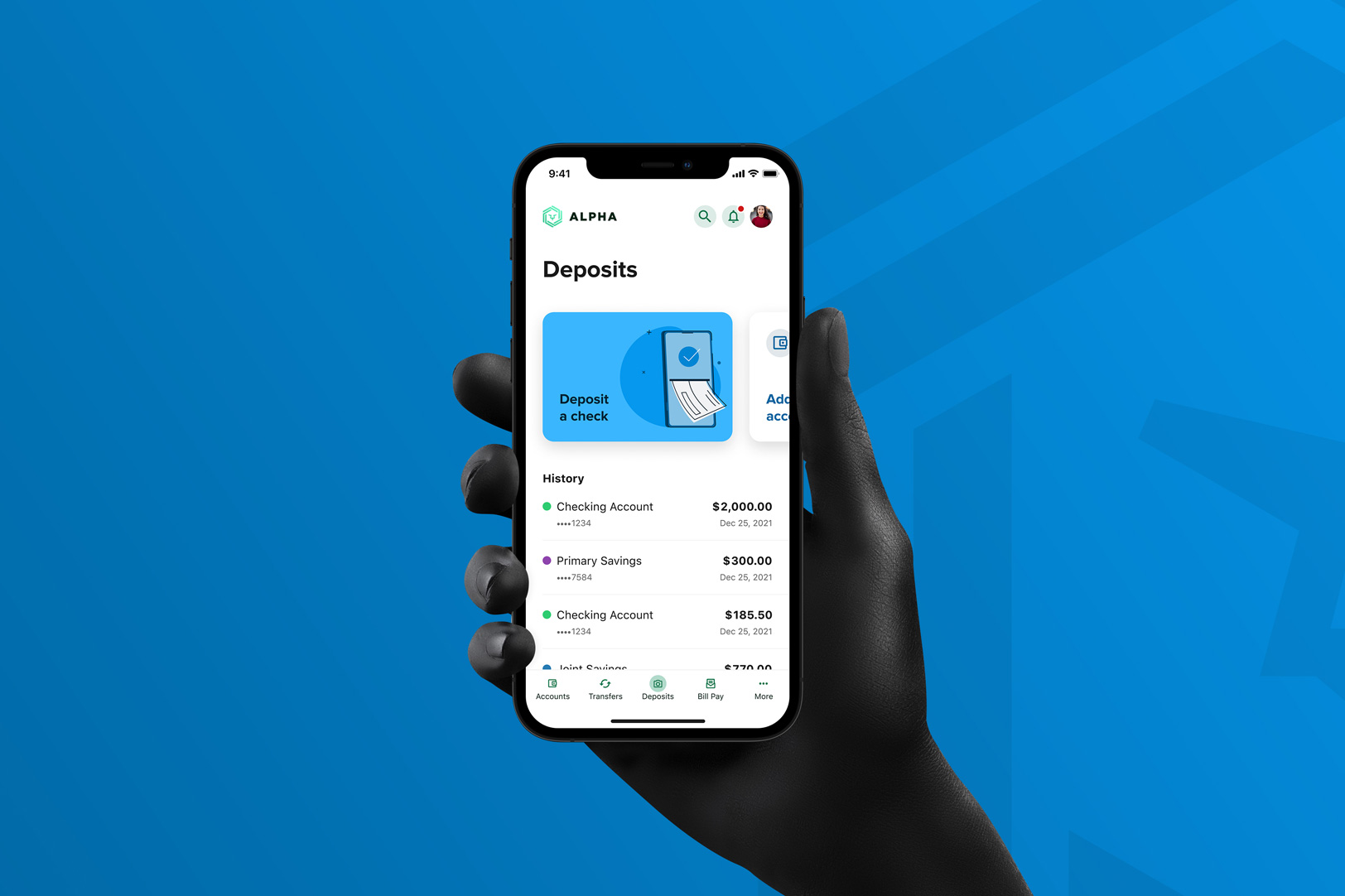
Mobile Deposit helps you to save time by depositing checks remotely, no matter where you are or what time of day it is. Instead of making a run to the bank, you can simply snap a picture of the front and back of the check on your smartphone and deposit it using our mobile app. Simply endorse your check, take a picture of the front and back, and just a few quick taps to submit your deposit. The previous mobile deposit experience was designed prior to 2017 and lacked a lot of the features end-users had come to expect in the modern era. From a design perspective, I was tasked with updating the mobile experience to utilize Alkami’s latest design system, improve the overall experience for end-users, and enable engineering to create a more scalable code base for future releases using Flutter.

The Challenge —
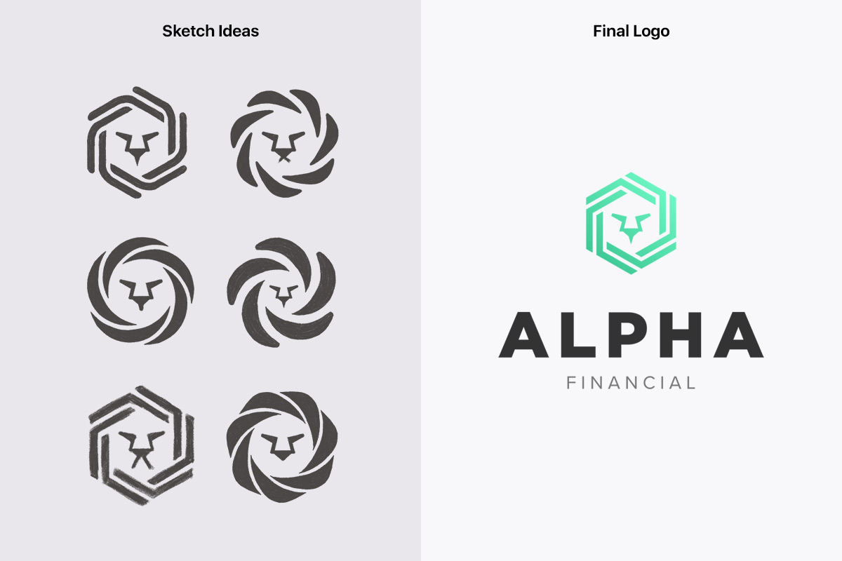
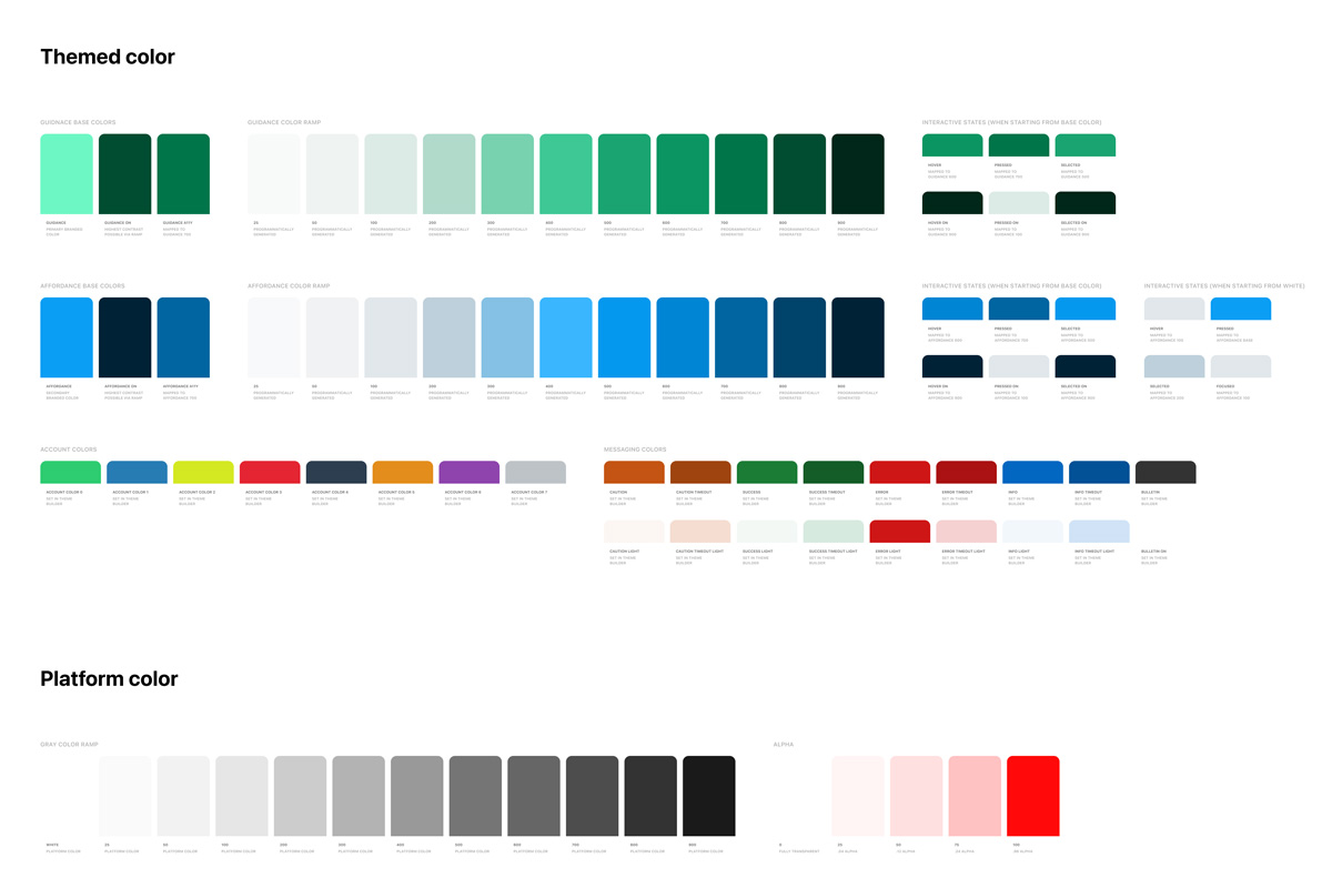
Although it is still widely used, Mobile Deposits usage is dominated by mostly generations like Baby Boomers and Gen Xers, with end-users accessing via mobile device. Even though millennials and Gen Z users have little knowledge of mobile deposits as they typically use direct deposit or P2P platforms. With the COVID-19 pandemic affecting everybody, I had to create a way for generations old and new to be able to make deposits via their mobile devices. No more having to go into a physical building and talk to a bank teller to make a check deposit. The previous mobile experience’s vendor customizations and complex user interface made it difficult for new users to understand how to accomplish simple tasks like selecting an account or uploading a check’s image. To boot, I had the opportunity to design Alkami’s financial institute logo for our yearly client conference, which included a logo and brand style colors that you’ll see below. The goal was to move away from the tired, outdated corporate colors and towards the new age of mobile banking; this has been our demo FI brand moving forward for all our showcases and new products.
Discovery & Ideation —
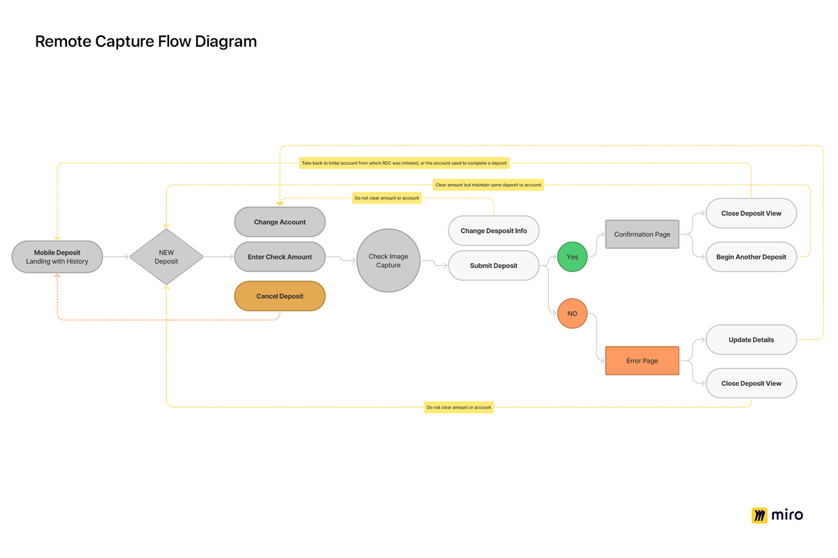
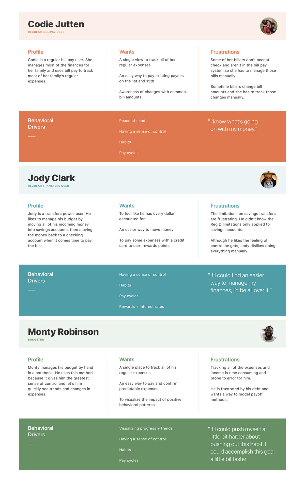
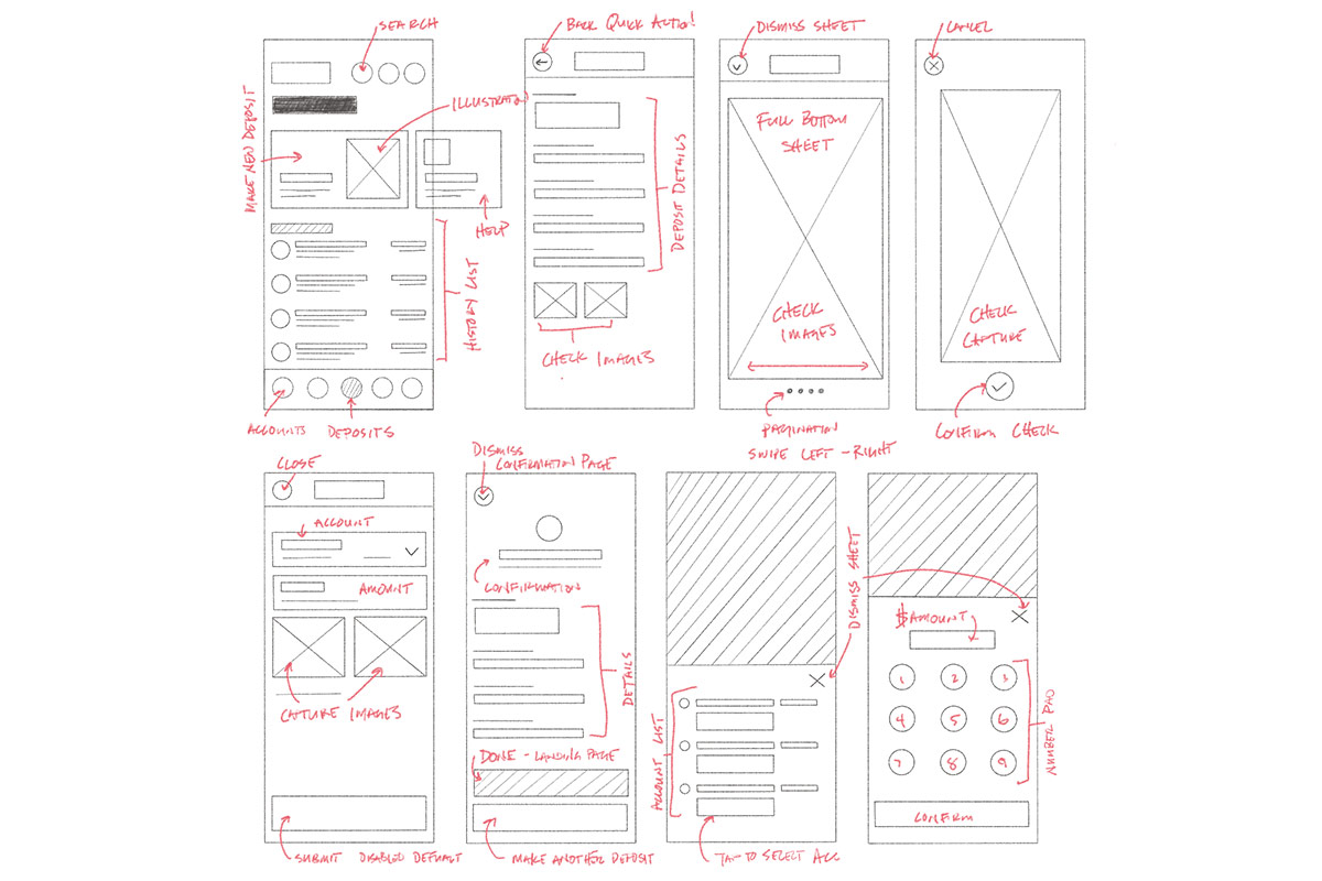
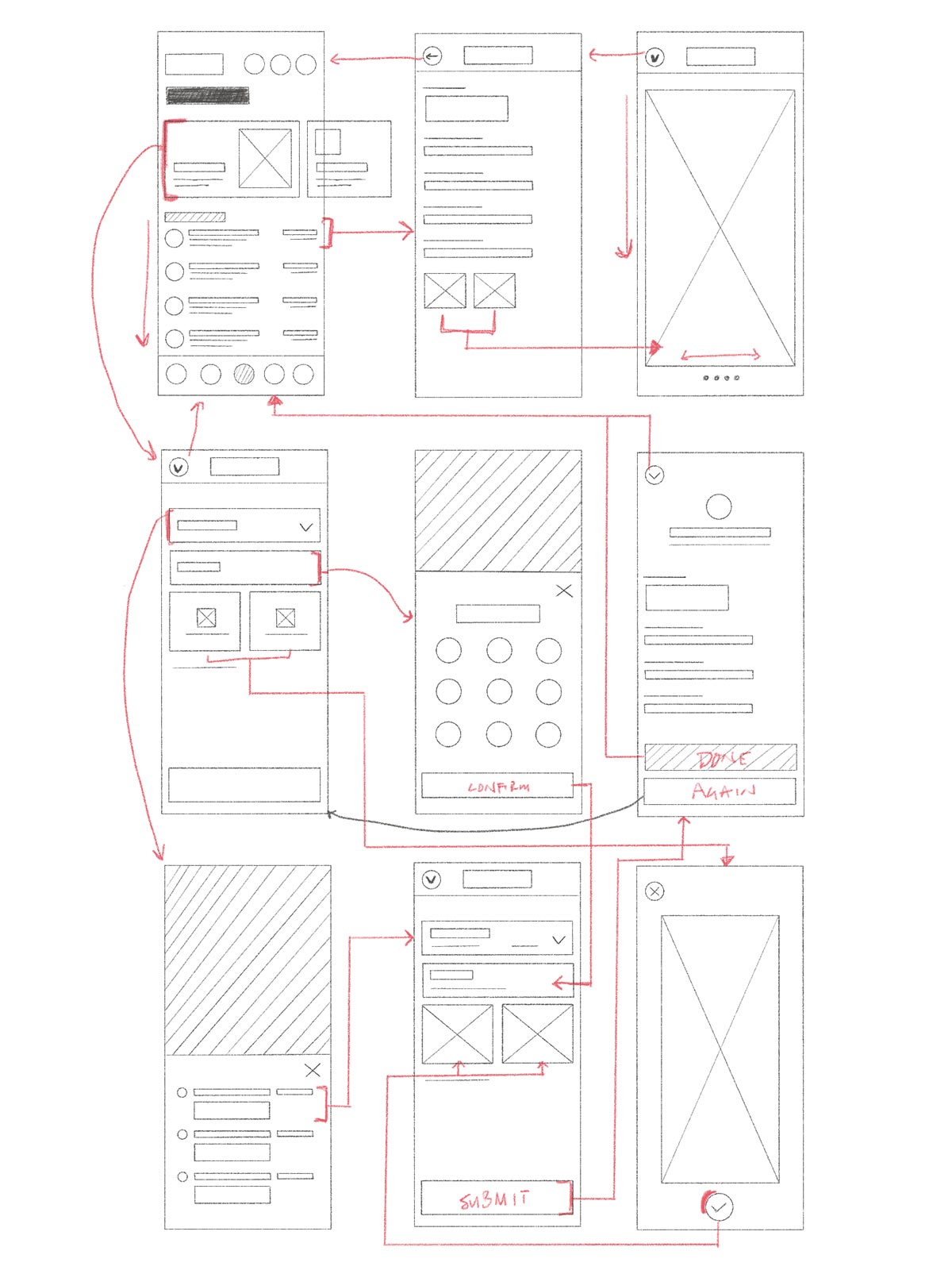
I was tasked to define the vision and craft the updated experience of this mobile app feature. First thing was to utilize the design team’s existing money movement personas, which were created by our design team when we interviewed end-users of our money movement products, to gain more knowledge about end-users wants, pain points, and drivers. I moved to mapping user journeys and creating a flow diagram so I can find all the holes in our current experience. After that was set I moved to draw and sketching wireframes to understand a user’s interactions and navigation patterns that could be used in the process. The goal was to make the experience very simple and super easy to use. I created a lo-fi design to conduct a quick usability test to measure how well users can successfully perform simple tasks and help us identify any usability issues and pain points. After many sketches and rounds of iterations, I gathered feedback from our design team, product owner, and the tech lead. All the collaboration and feedback helped shape the final direction of the hi-fi designs.
Solution —
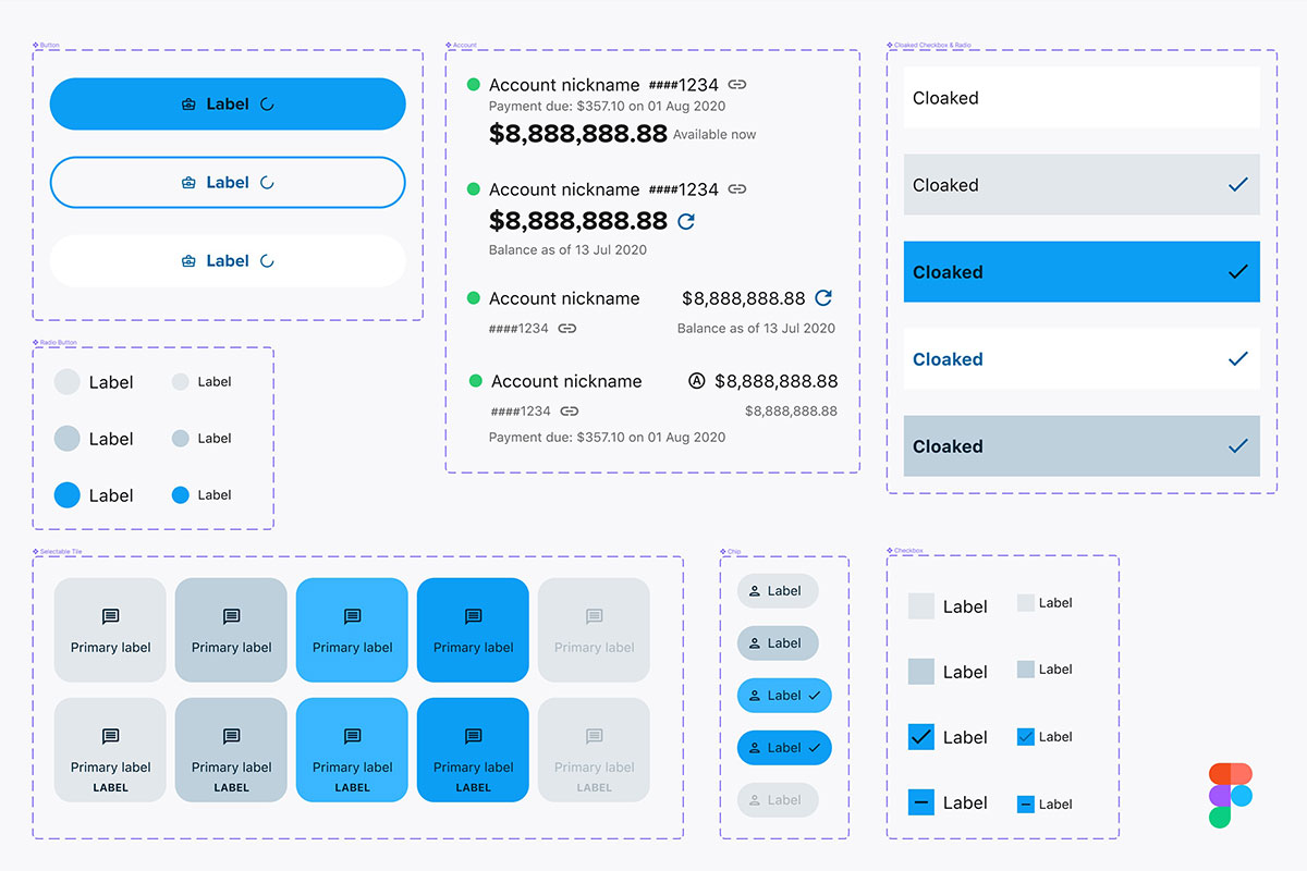
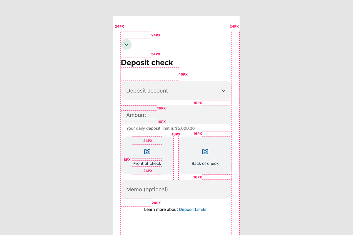
As the lead designer on this project, I adopted Alkami’s design system (Iris 2) and language into the Mobile Deposits and created parity with existing mobile money movement products in order to open a future path for a more consistent user experience. Currently, in native applications, any new feature or defect has to be addressed in both the iOS and Android codebases. By moving the Mobile Deposits product into a single Flutter codebase allows us to ensure functional parity between all platforms while iterating quickly on new features.
Touchpoints
